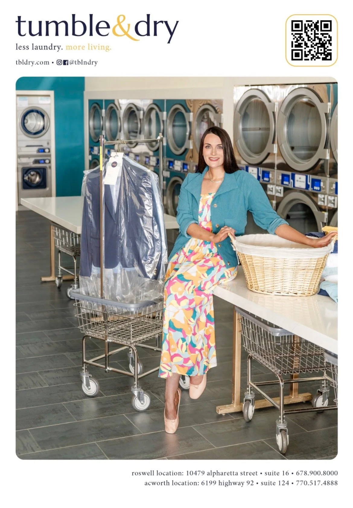
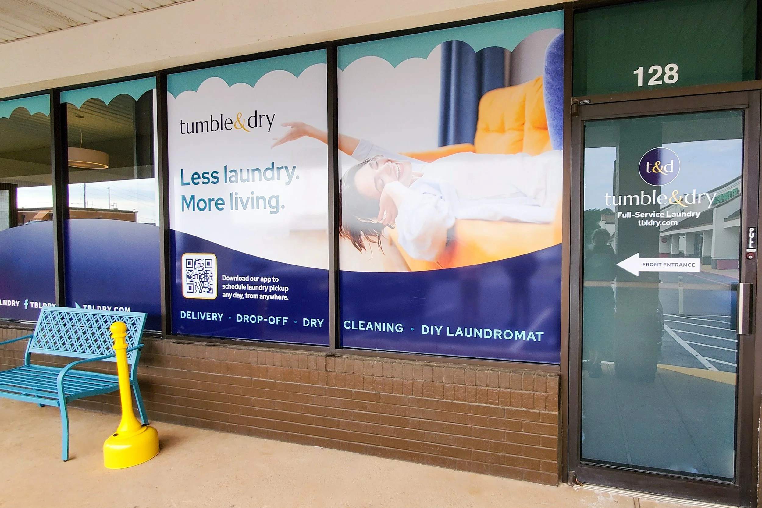
Meet Tumble & Dry
Not your mother’s full-service, luxury laundromat—where a commitment to convenience helps you save time and live more with one less chore.
Brand Identity | Logo Design | Branding Suite | Style Guidelines | Website Direction | Print Collateral | Signage & Environmental Design | Ads & Articles

Brand Story
Take a load off at Tumble & Dry, and find yourself wishing every day was laundry day. From delivery at the press of a button, to drop-off and DIY coin, Tumble & Dry caters to individuals and families at every stage of the life cycle.
No matter which way you fold it, T&D remains iron-clad in their commitment to convenience without compromising on quality. With expert staff, state-of-the-art machinery, and an easy-to-use app, T&D transforms chores into a catalyst for conserving your most valuable resource: time.
Less laundry, more living—that’s the T&D way.
Visual Identity
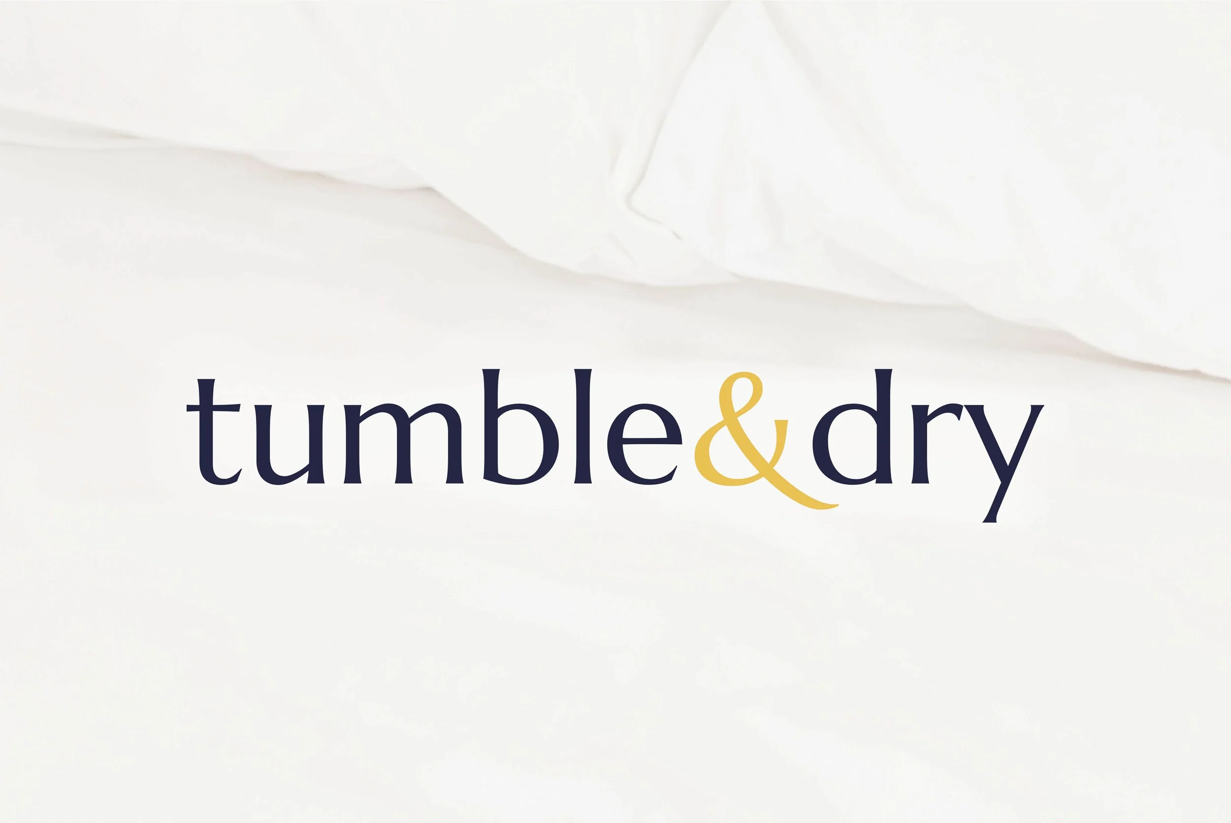
Logo Design
Tumble & Dry’s elegant logotype reflects the singular luxury of the brand experience, redefining what one would expect from a laundromat. The primary logos are accented by a flourishing golden ampersand, conveying a hint of opulence. The ampersand’s curve almost feels like an invitation to something a bit elevated, yet familiar—in this case, a laundry service that’s as dependable as it is delightful. Altogether, the logo conveys cleanliness without pedantry, and sophistication without snobbery.
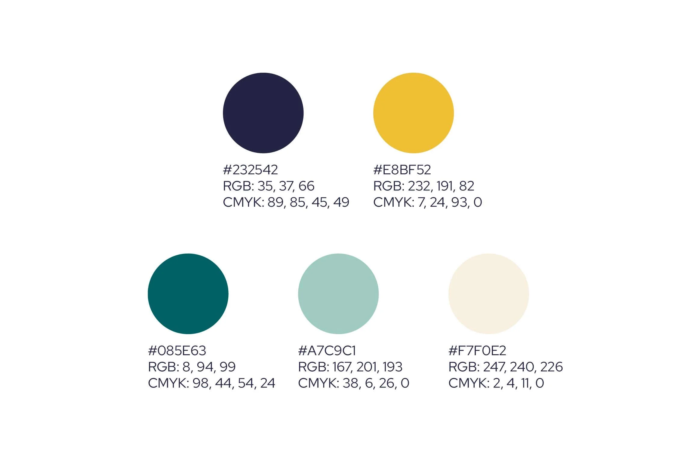
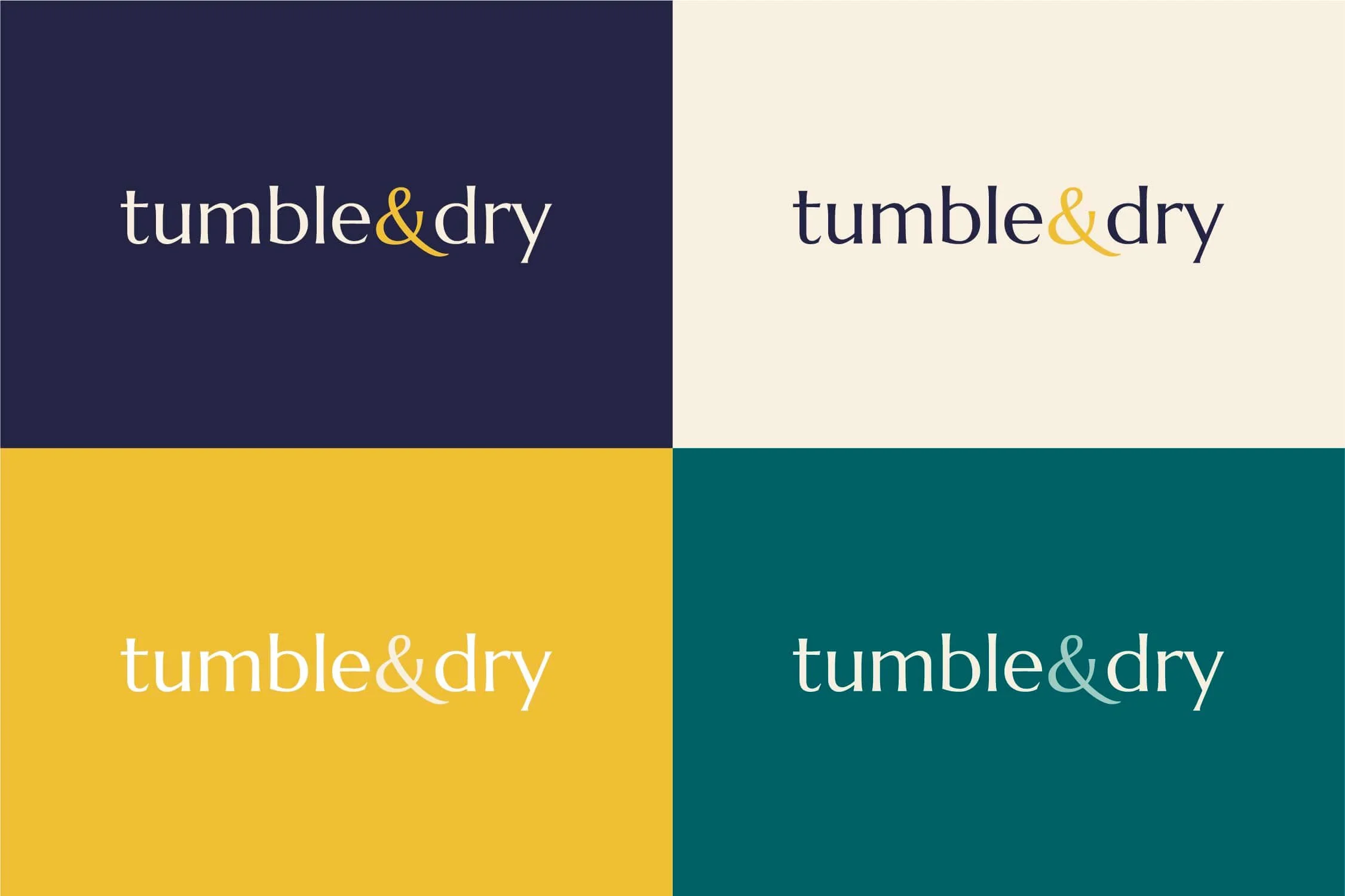
Color Palette
Tumble & Dry’s nuanced palette makes a statement that whispers rather than shouts: classic elegance meets modern luxury, all in an unexpected place. An oceanic navy holds down the pillow fort and complements warmer tones. The yellow-gold introduces a welcome vibrancy, while the linen offers a softer, more subdued warmth that evokes a sense of lived-in comfort. Deep teal and subtle seafoam offset each other, introducing tertiary hues that invite a feeling of refreshing calm.

Type System
The pairing of Marcellus and Red Hat strikes a charming balance between classic and contemporary. Marcellus’ smooth curves, airy letterforms, and near-imperceptible serifs bring forth a sense of casual refinement and grace. By elevating the perceived value of headline information—and likewise, the content it introduces—Marcellus enables the optimal flow of information. In contrast, Red Hat offers clean, geometric precision, ensuring readability at smaller sizes, such as in body text and lead-in statements.