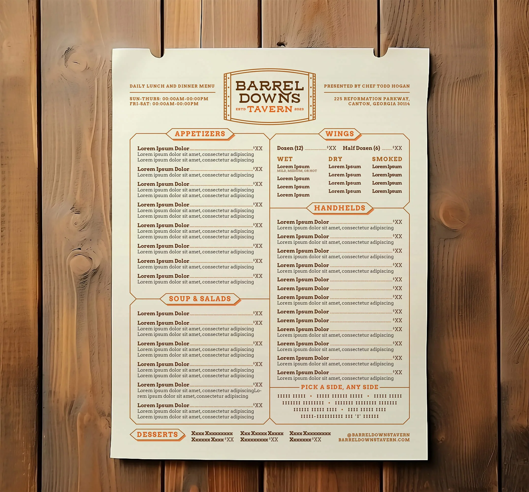
Meet Barrel Downs Tavern
An epicurean mess-hall-of-fame blending old-school charm with chef-driven innovation, where discerning pals gather to clink, drink, and feast—their eyes on the game.
Brand Identity | Logo Design | Branding Suite | Style Guidelines | Menu Design | Print Collateral Concepts
Brand Story
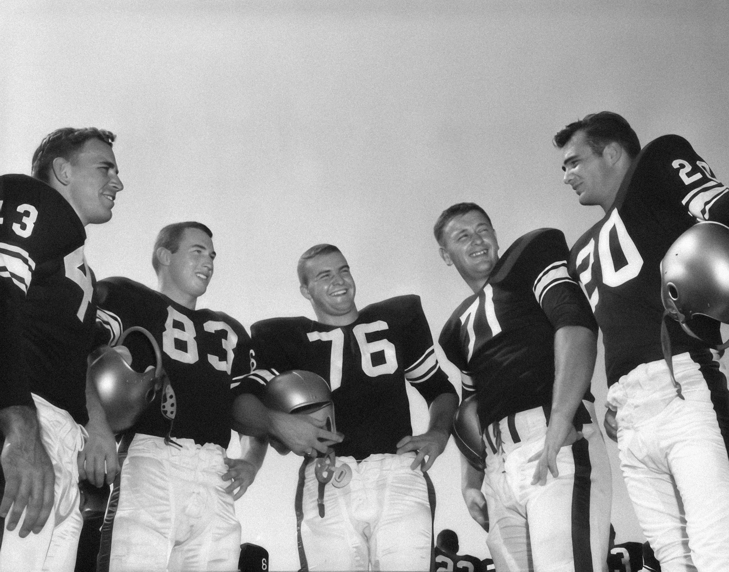
Trimmed with sports memorabilia, warm lighting, and a well-stocked library of liquor, the tavern atmosphere evokes nostalgia while embracing modern comforts. Every detail invites guests to return—from gourmet takes on pub grub to cozy seating and custom-infused cocktails. It’s more than a bar or a restaurant—it’s an immersive experience, reminiscent of the glory days of American football and Kentucky Derbies. For undefeated game-day views, delicious fan fare, and a guaranteed good time, go on up to Barrel Downs.
“No amount of physical contact could match the healing powers of a well-made cocktail.”
—David Sedaris
Visual Identity
This project was born from a collaboration between myself and two exceptionally talented colleagues. If you’d like to learn more, just ask!

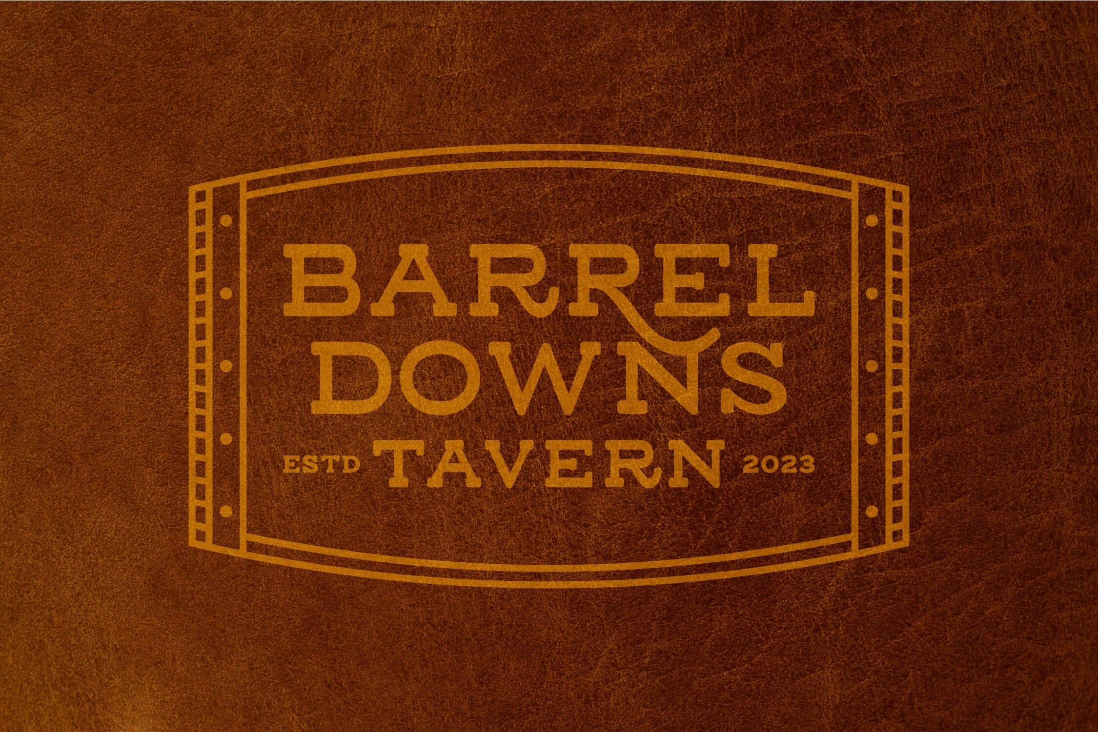
Logo Design
The two monoline emblems reflect tradition and craftsmanship, anchored by a barrel-inspired frame set at different angles. Dotted rivets, reminiscent of those holding a barrel together, enhance the symmetry and contribute to a sturdy, timeless feel. The ruggedness is offset by the casual sophistication of clean lines and soft, swooping serifs. Meanwhile, the monograms, reminiscent of cattle brands, allude to the searing, sizzling flavors featured on the menu, from hearty handhelds to complex cocktails.

Color Palette
Savory browns, reminiscent of vintage leather helmets and robust whiskey, set the tone for a full-bodied palette. Pill-Stitch Red, with its faded glory, serves both as a foundational color and an accent. Vibrant orange adds an unexpected twist, calling to mind the zest of an Old-Fashioned garnish. All of the colors pair beautifully with an incandescent off-white, softening and balancing the palette. Meanwhile, its counterpart—a velvety black—sharpens contrast where needed.
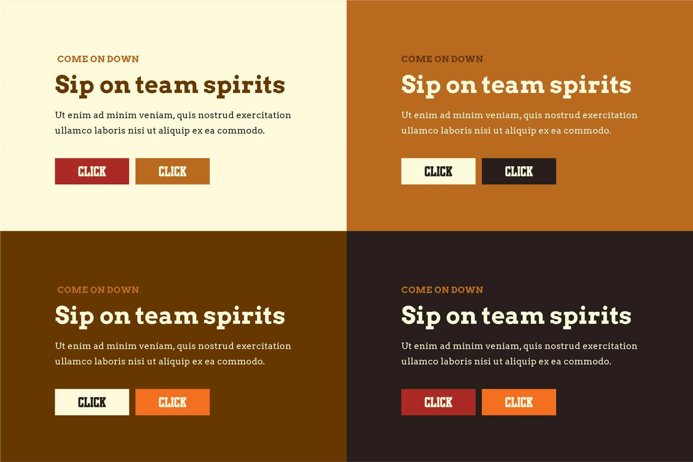
Type System
These fonts work hard and play hard, like a well-oiled team. Argo Bold, the star player, grabs attention and—quite literally—makes headlines. When used in all caps for decks and lead-ins, it reads with the same hype as Michael Buffer’s iconic “Let’s get ready to rumble!” Argo Regular, recruited for its reliable performance, guides the eye effortlessly through body text, like a player who never misses a pass. And the kicker? Jersey Club is subbed in for calls-to-action, where winning over the audience matters most.